 Webapps Online |
Webapps Online

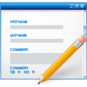
Tips for improving the forms on your website
Dated Sunday September 1, 2013
Forms are a essential tool for communicating with your visitors on your website. Sadly forms are often set up incorrectly, detering the visitor from using them. A few tips to improve the conversion rate of your forms:
Keep your forms as short as possible
Filling in forms are not everybodies favorate pastime. No problem if it can be done in a minute and it is beneficial to the visitor, but don't pester them with long forms and ununnecessary questions. With every question the visitor is going to ask himself, why do they realy need to know this? So the golden rule is: the shorter the form, the more people will use it.
Devide long forms over multiple steps
If for some reason the form cannot be shortened, devide it over multiple steps. This is often seen in the ordering process on webshops. Start out with the questions the visitor wants to fill in, i.e. "what do you want to buy". End the process with the least favorable questions, like phone number or credit card details. Deviding the form over mulitple steps has a few advantages:
- The form is less intimidating
- If a required filled is not (or incorrectly) filled in, it is easy to spot
- By asking the least favorable questions last, more people will complete the process. Stopping now after putting in the effort in the previous steps seems like a wast of time.
When deviding the form over multiple steps it is importand to show how many steps there are and how far along the visitor is.
Keep required fields to a minimum
For the same reason you need to keep the forms short, you need to keep the number of required fields to a minimum. Only make the fields required that are essential for you to know. We know you realy want to know "how did you find out about our website?". But ask yourself this: do you rather hear nothing from a visitor (because he or she did not fill in the form). Or do you only want to get there email adress and name, so you can ask them again in a later stage?
Especially in a contact form; only ask for name, email and/or phone number. All other questions should be optional, you can ask them again later if you realy want to know.
Highlight the active field
By highlighting the active field, it is clear to the visitor where in the form he is at the moment. This is mainly usefull for people who navigate to form using the tab button.
Use a asterix (*) to mark required fields
Marking a required field with a asterix is a convention used all over the internet. Using the asterix makes is clear to the visitor whats expected of him at first glance. So refrain yourself form overdesigning this feature. When it comes to forms: it is function first, design second.
Have a reasonable font size in input fields
Font sizes on websites are often to small for realxed reading. But when it comes to forms, they tend to be even smaller. Make sure you avoid this pittfall. You don't want visitors to squeeze there eyes, just to see if they haven't mispelled there email address.
Prefill fields
If you know your visitor (for example, when he or she just logged in), prefill the form with the information you already know. It looks very clumsy when you ask a visitor for information, they know you already know. Especially when it is information most people are reluctant to give, like email adresses.
Do not hide the fields however. Give the visitor a chance to change the information in the fields if they feel it is necessary.
Use a double input on password field, not on email
Having visitors filling in there email address twice: is that realy necessary? It happens very often, but mainly irritates people. And it is common practice to copy the information from the first field to the second. Make the entire double check useless.
If filling in the correct email address is vital, for you as well as for the visitor, explain why. If the visitor is convinced of the necessity of filling in a correct email adress, he will double check it himself.
Don't change or clear filled fields
If a form is re-presented because one of the required fields was not filled in or filled in incorrectly, make sure to present the form exactly as the visitor had filled it. Noting is more agonizing then to retype a password (double) because you forgot to fill in an other required field. Or to opt out of an newsletter again and again.
Even the captcha should be prefilled or left out the second time the form is show. You where convinced it was a human who filled in the form the first time, so why check again?
Start with the most selected options
If 9 out of then visitors select United States as country in there address, make sure this is the first option in the drop down box. This makes filling in the form a lot easier for 90% of your visitors.
Have the "tab" function work correctly
More and more people use the tab button to go to the next field. This way, you don't need a mouse to fill in the form. Check your form to see if the tab button indeed goes to every next field.
Explain the necessity of the questions
Most specially when you ask privacy related questions. If you realy need the email address of your visitor: tell them why. And explain the benefits. Also clearify wether or not it will be used for your or other newsletters. A link to your privacy statement might help.


