 Webapps Online |
Webapps Online
Why people expect a different experience on mobiele websites
Dated Monday September 30, 2013

With the growing number of smart phones worldwide, the number of mobile friendly website grows as well. A mobile friendly website simple means that is designed for viewing and use on mobile devices as smart phones.
A mobile website is different ...
When you design and build a mobile website, the technique is always on top of mind. Certain languages or frameworks are explicitly for mobile use and others, like Flash, are unavailable on most mobile devices. The size of the frameworks and the amount of data necessary to display a page are also factors to consider, since loading a large page over a slow internet connection takes away from the user experience.
The design of mobile websites also requires a new vision on how to design websites. With only a fraction of the screen size desktop website and a crude pointing device (your finger), means managing your available screen space and interactive elements requires a lot of attention.
... but a mobile user differs as well
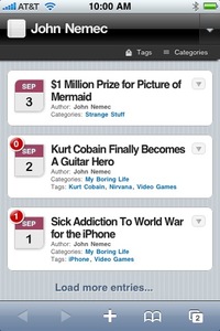
Sadly, the content of mobile website does not get the same love and attention as the design does. Mostly it is just the same content as presented on the desktop version of the website. Which means the mobile friendly design is ruined by mobile unfriendly content. Large images, tables that won't fit on your screen or references to parts of the website that have been left out in the mobile version of the website.
But it gets worse. Pages with text that go on and on and on. Forcing you to scroll until you fingers start to hurt.
And it is not only the screen size that makes the experience on mobile less pleasant. It is also the state of mind where in. Behind the desktop computer or laptop where probably not going anywhere. We have the time to read a lot of information (and most of the times we want just that). We have a keyboard and mouse, so filling in long forms is no problem. When we use our phone we tend to look for small pieces of information fast. We don't like to click or scroll to get where we want to be. A form of 3 or 4 fields is no problem if it gets us where we want to be, but thats it. We want to have the information or completed the task before the commercial is over or before the bus arrives.
So don't pester your mobile visitors with the complete history of your company. Or with tons of details on each product or service. Be to the point, keep it simple. Remove the pages that are to complex or detailed from the mobile version all together. Reduce the menu to: this is who we are, why you want to do business with us and this is how to contact / order.
That does not mean that mobile means less
Although we insist you leave out a lot of the content on the mobile version of the website, it does not mean it should be less of a website. There are many things only a mobile website can do. The mobile website knows where you are, the desktop website does not. Using this information you can offer a lot of features and content that is instantly more relevant to the visitor then all the content on the desktop website. It could be as simple as showing directions from the visitors current location to your office. But you could also use the geographic location to preselect products that are popular in that region.
The second feature you can make the most of is the fact phones have address books that the user actively use. With a simple link you can offer business cards and contact information that is stored in the address book. Making sure the visitor will be able to contact you long after they visited the website.
Creating mobile content does help
When your done with designing and building the mobile website: take the last step to create the mobile content:
- Shorten texts on mobile or leave the page out of the menu
- Shorten forms and send a mail with a link so visitors can complete the form when they have access to a desktop computer / laptop
- Contact page (address and phone number) never more then one click away
- Don't offer information in PDF files
- Don't link to files that don't have a mobile friendly version


