 Webapps Online |
Webapps Online
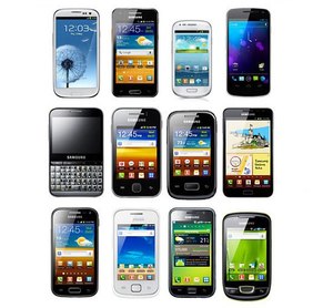
Creating a mobile website for Samsung phones
Dated Saturday January 11, 2014

Where Apple had created a new market for smartphones with the launch of the iPhone, it is Samsung that is dominating it now. With more and more people browsing the internet on their phone, making sure your (mobile) website is ready for Samsung phones becomes a necessity.
Why Samsung; not smartphones or Android phones?
With the release and success of the Galaxy phone series, Samsung has created a eco-system of its own. With a wide range of hardware specifications that matter for mobile website, like speed and screen resolution, looking at Android phone would be to narrow. Making your mobile website work on all smartphones is a near impossible task. With a market dominated by Samsung, it makes sense to use their phones as the first benchmark for your website.
Android: a segmented market
Although Samsung provides an Android upgrade for their flagship phones once in a while, most phones never get a higher version of Android then the version then came with them when they were bought. With new versions of Android and better Galaxy phones each year, the number of Android version still used keeps lying further apart. In 2013 the following relevant versions of Android where in use:
-
Older then 2.3: 1.6%
-
Android 2.3: 24.1%
-
Android 4.0: 18.6%
-
Android 4.1: 37.4%
-
Android 4.2: 12.9%
-
Android 4.3: 4.2%
-
Android 4.4: 1.1%
Android 2.3 is the most worrying of the lot. The native browser of Android (which almost all users of the Samsung phones use) was already up to shape when it came down to HTML 5 and CSS 3. Not a lot of worries there. The javascript engine on the other hand was a problem. Performance was poor.
With Android 2.3 still popular, keep complex javascript and jQuery to a minimum. When you want to use javascript and ajax, try to rely on known implementations and mobile javascript frameworks. Try to find an old Samsung phone (i.e. the Samsung Galaxy II) to test if your website performs in a acceptable speed.
Screen resolutions
Samsung was the first to release a phablet (mix between a smartphone and a tablet) to the market. As a result screen resolutions on Samsung phone come in all forms and shapes (literally). The largest phone at the moment is the Galaxy Note with a resolution of 800 by 1280. The smallest phone are the first of Galaxy Series (1, 2 and 3) with a resolution of 480 by 800. If you develop for all phones, keep in mind that there are even phones with a resolution of 320 by 200, like the Blackberry Curve.
Having all these resolutions poses two problems. First the lay-out. Designing a website and testing it on you own phone clearly won't work. Other phones may be twice as back or small. You must design your website to scale with the width of the screen. For practical reasons, you might take the 480 of the Galaxy as a minimum, which will cover over 90% of the phones.
The second problem becomes the detection of smartphones. Many scripts that detect smartphones use the screen resolution to test if a device is a smartphone. Now smartphone are getting bigger and tablets are getting smaller, you need to rely more on user agent strings for detection than the actual screen size of the device.
And of course the basics of mobile website design
Although the complete collection of Samsung phone have a lot difference between them, they are all smartphones. That means that all the basic rules of mobile website design apply to them:
-
Redesign your website for mobile: it is impossible to just resize your website to such a small screen, you need to rethink the design
-
Mobile phone use touch: that means no small buttons, no lists of links, and no hovers
-
Most mobile phones use 3G: so small pages are important. Use small images and do not use images for lay-out or design
-
Using a smartphone is not as convenient as a desktop computer: keep text short to avoid to much scrolling and keep the number of fields in forms to a minimum.
Looking for a ready to use solution?
Does creating your own mobile website from scratch sound like to much hassle? Then you can try our mobile website tool. It helps you to create, publish and host a mobile website. You can concentrate on the message you want to tell, we will get it on every phone!


